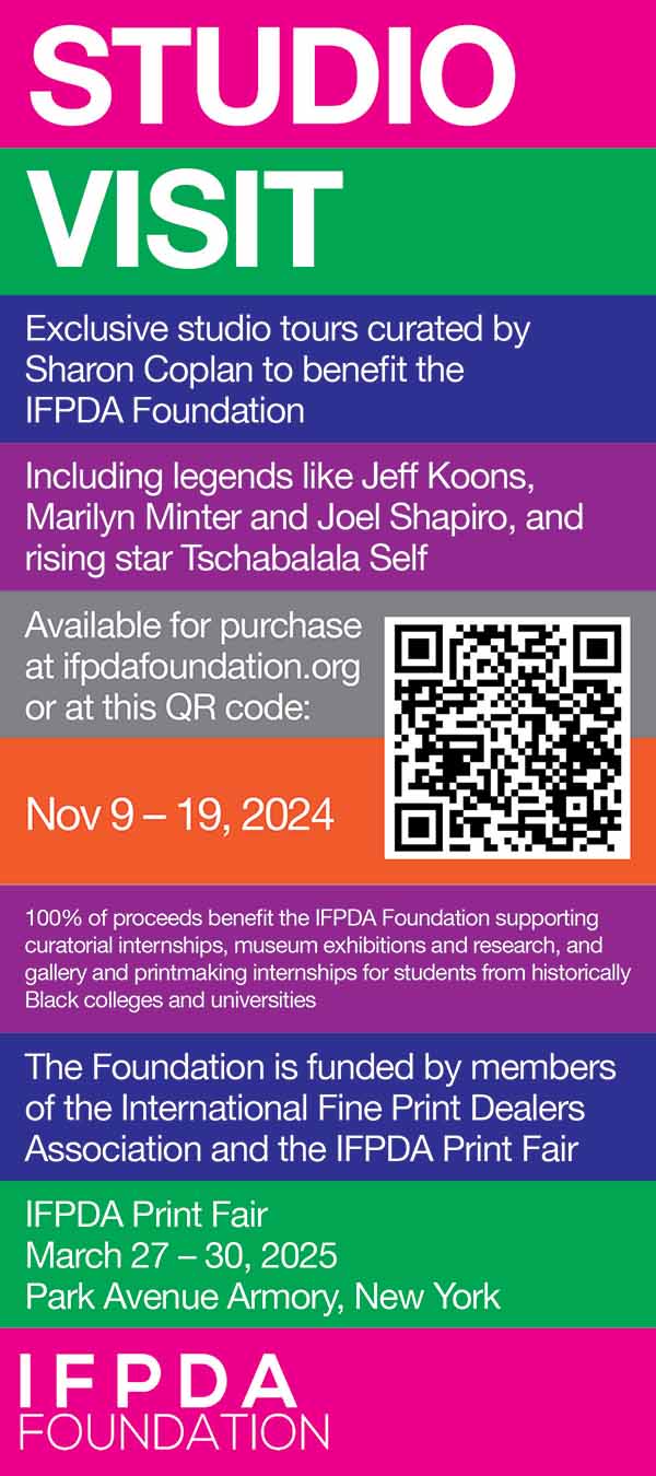
The International Fine Print Dealers Association (IFPDA) commissioned an identity design and brochure design for Studio Visit, a sale of artist-led studio tours benefitting the IFPDA Foundation. Available for purchase were tours with leading contemporary artists such as Jeffrey Gibson, Jeff Koons, and Mickalene Thomas. The sale also featured an opening event at Christie’s Auction House, featuring a conversation with and site-specific installation by contemporary artist Tschabalala Self. The sale was curated by Sharon Coplan.
Artists
The following artists participated in the Studio Visit sale by offering studio tours:
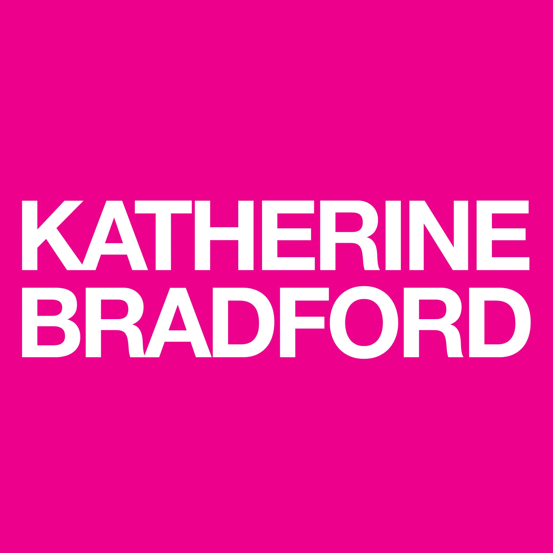
- Katherine Bradford
- Jeffrey Gibson
- Vera Lutter
- Marilyn Minter
- Joel Shapiro
- Leonardo Drew
- Jeff Koons
- Joel Mesler
- Tschabalala Self
- Mickalene Thomas
Visual Identity
For the visual identity of this benefit sale, we developed a color palette that both popped and distinguished the names of the artists from one another. After trying several palettes, we settled on the following colors: magenta, green, indigo, purple, orange, and cyan. For advertisements and posters, bars of these colors separate the names of artists as well as lines of text. White, left-aligned sans-serif text rests inside each colored section. For specific artists’ thumbnails on the product page of the sale, we placed the artist’s name on top of one of the colors of the palette. All printed graphics are full-bleed, and each bar extends from the left side of the page to the right side. The Studio Visit title, call to action, and names of artists are in all caps, while the rest of the text is in sentence case.
Flyer Design
To familiarize attendees of the sale’s opening night, we designed a flyer that includes information about the purpose of the sale and the artists offering studio tours. The flyer features an array of horizontal bars in alternating colors as prescribed by the visual identity. Each bar contains a distinct message or name of an artist.
Artist Thumbnails
For each artist’s studio visit available for purchase online, we designed a simplistic, square product thumbnail. Each thumbnail features the name of the artist in white Helvetica Neue Bold, overlayed on a solid background in one of the colors of the visual identity.
Naming
Selecting a memorable, appropriate name was essential to the success and overall design of this benefit sale. We decided that the of the sale should be short but punchy. The name had to reference the object sold –– tours with leading contemporary artists. After deliberation, we decided that “Studio Visit” was a punchy and appropriate title. The singular noun, as opposed to plural, feels more personal and intimate than if the title were “Studio Visits.”
With the name decided, we could finalize our designs and begin the production and printing process.
Challenges
Cohesiveness: Designing a cohesive visual identity for 11 different contemporary artists, was a challenge. Using a simplistic yet colorful visual identity helped unify the artists without being overbearing.
Press
Artnet
Artnews
Hypebeast
Displayed on Studio Visit webpage and social media releases