12.15.23 – 01.18.24
I Feel Real when You Hold Me
2024
The components of the visual identity of this booth design are straightforward: a red/orange/green color scheme and typography in white Helvetica Neue Bold. This simplicity helped draw in curious fairgoers and convey relevant information quickly without drawing attention from the blankets being sold. Moreover, by keeping the visual identity simple, we created digital mockups and printed matter more quickly, allowing more time for feedback from the artist and other collaborators on this project.
The colors we used in the design of this booth take inspiration from samples of the artist’s blanket piece being sold. The final colors of the booth were ultimately approved by the artist.
from I Feel Real When You Hold Me
from I Feel Real When You Hold Me
from I Feel Real When You Hold Me
We purchased a 3-panel, U-shaped booth at the fair to advertise the blankets. The space was roughly 100 square feet, which we divided to accommodate the following three sections: an information table, a walkway, and a pedestal where the blankets were displayed. On each wall, we installed full-coverage vinyl, featuring bold colors and displaying information about the artist and project. Using a different background color for each panel distinguished the three sections of information and contributed to a booth appearance that was different from the other booth designs in the fair.
Throughout the booth design, we use white Helvetica Neue Bold for its legibility and versatility. We emphasized “Jeffrey Gibson” in the center panel by increasing the font size until the artist’s name stretched from one margin of the panel to the other.
We rented a wide table from the Park Avenue Armory to use as an information station, where guests could ask initial questions about the project and the booth. We also rented a mannequin stand where we displayed a prototype of the blanket draped across shoulders. Guests were welcome to approach the blanket to view it up close and feel its texture.
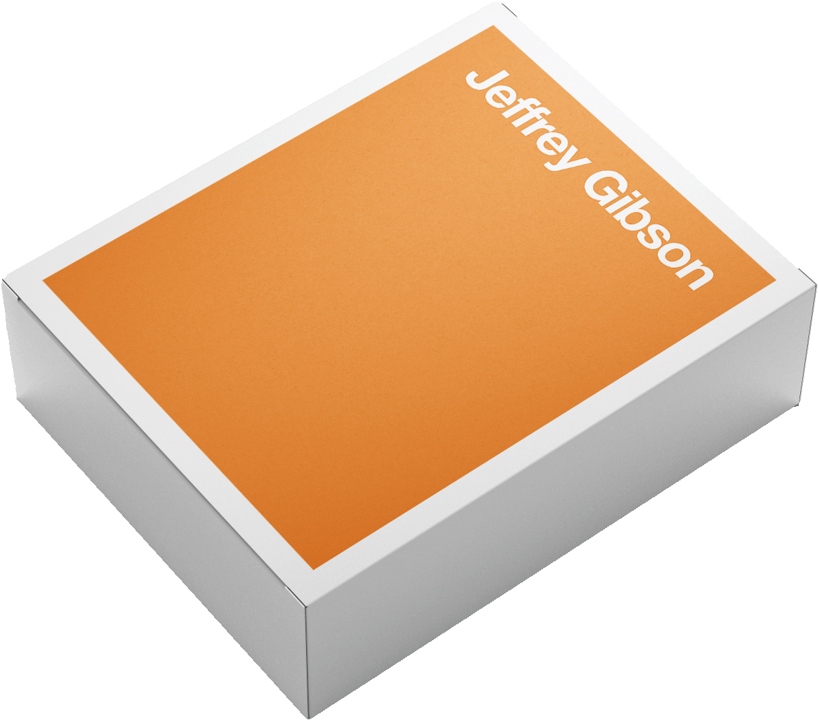
As part of our work for the 2024 IFPDA Print Fair, we also designed custom packaging for all 60 editions of the blanket. The packaging design uses the same colors and simplistic typographic layout as the booth, creating a cohesive experience for fair attendees and buyers. Each buyer received a package featuring one of the three colors in the booth, chosen at random. The packaging ultimately came to life by placing printed vinyl on top of a box manufactured by Talas.
The 24-hour window in which we had to set up the booth, from start to finish, felt particularly short. Originally, we had hoped to paint the walls of the booth in the colors we had selected from the blanket, and then add vinyl lettering on top once the paint had dried. However, because the paint would not have dried within 24 hours, we decided to print full vinyl sheets (containing both the typography and the background colors) to install throughout the booth.
Back